use custom render
Publish date: Apr 26, 2019Tags: r devel render
In knitr/R/hooks-md.R there is a custom function render_jekyll.
I wrote a similar one for hugo that makes figure shortcodes.
Then I could remove the perl from the makefile.
This was a dirty hack which I am happy to got rid of.
Suppose I will add some more shortcodes in the future.
For now see some examples here:
I use some examples from Producing Simple Graphs with R.
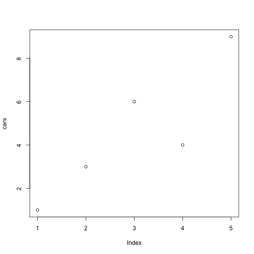
# Define the cars vector with 5 values
cars <- c(1, 3, 6, 4, 9)

# Graph the cars vector with all defaults
plot(cars)
Lorem ipsum dolor sit amet, consectetur adipisicing elit, sed do eiusmod tempor incididunt ut labore et dolore magna aliqua. Ut enim ad minim veniam, quis nostrud exercitation ullamco laboris nisi ut aliquip ex ea commodo consequat. Duis aute irure dolor in reprehenderit in voluptate velit esse cillum dolore eu fugiat nulla pariatur. Excepteur sint occaecat cupidatat non proident, sunt in culpa qui officia deserunt mollit anim id est laborum.
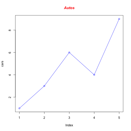
# Define the cars vector with 5 values
cars <- c(1, 3, 6, 4, 9)

# Graph cars using blue points overlayed by a line
plot(cars, type="o", col="blue")

# Create a title with a red, bold/italic font
title(main="Autos", col.main="red", font.main=4)
Lorem ipsum dolor sit amet, consectetur adipisicing elit, sed do eiusmod tempor incididunt ut labore et dolore magna aliqua. Ut enim ad minim veniam, quis nostrud exercitation ullamco laboris nisi ut aliquip ex ea commodo consequat. Duis aute irure dolor in reprehenderit in voluptate velit esse cillum dolore eu fugiat nulla pariatur. Excepteur sint occaecat cupidatat non proident, sunt in culpa qui officia deserunt mollit anim id est laborum.
# Define 2 vectors
cars <- c(1, 3, 6, 4, 9)
trucks <- c(2, 5, 4, 5, 12)

# Calculate range from 0 to max value of cars and trucks
g_range <- range(0, cars, trucks)

# Graph autos using y axis that ranges from 0 to max
# value in cars or trucks vector.  Turn off axes and
# annotations (axis labels) so we can specify them ourself
plot(cars, type="o", col="blue", ylim=g_range,
   axes=FALSE, ann=FALSE)

# Make x axis using Mon-Fri labels
axis(1, at=1:5, lab=c("Mon","Tue","Wed","Thu","Fri"))

# Make y axis with horizontal labels that display ticks at
# every 4 marks. 4*0:g_range[2] is equivalent to c(0,4,8,12).
axis(2, las=1, at=4*0:g_range[2])

# Create box around plot
box()

# Graph trucks with red dashed line and square points
lines(trucks, type="o", pch=22, lty=2, col="red")

# Create a title with a red, bold/italic font
title(main="Autos", col.main="red", font.main=4)

# Label the x and y axes with dark green text
title(xlab="Days", col.lab=rgb(0,0.5,0))
title(ylab="Total", col.lab=rgb(0,0.5,0))

# Create a legend at (1, g_range[2]) that is slightly smaller
# (cex) and uses the same line colors and points used by
# the actual plots
legend(1, g_range[2], c("cars","trucks"), cex=0.8,
   col=c("blue","red"), pch=21:22, lty=1:2);
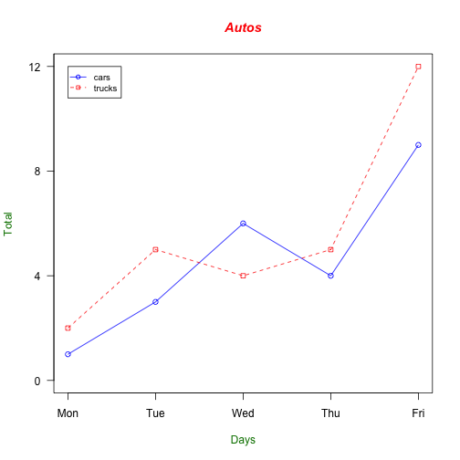
Figure to the left uses {r, fig.cssClass="float-left"}
Lorem ipsum dolor sit amet, consectetur adipisicing elit, sed do eiusmod tempor incididunt ut labore et dolore magna aliqua. Ut enim ad minim veniam, quis nostrud exercitation ullamco laboris nisi ut aliquip ex ea commodo consequat. Duis aute irure dolor in reprehenderit in voluptate velit esse cillum dolore eu fugiat nulla pariatur. Excepteur sint occaecat cupidatat non proident, sunt in culpa qui officia deserunt mollit anim id est laborum.